Rakuten Group · iOS · Android
Rakuten wanted to bundle free music into its mobile plans. The labels wouldn't allow unlimited streaming, so the plan launched with a five-hour monthly cap. This is what I designed inside that constraint.
01 — Problem Definition
Subscriber numbers weren't growing at the rate the business needed. The question assigned to the team: how do we grow members?
Before jumping to solutions, I analysed how competitors had achieved scale — and one pattern stood out clearly.
Finding 01
Apple Music grows through Apple devices. LINE MUSIC grows through LINE's 95M+ Japanese users. Services with platform distribution dramatically outperform standalone apps.
Finding 02
Rakuten Mobile had millions of subscribers. No mechanism existed to convert them into Rakuten Music users. This was a zero-cost acquisition channel sitting idle.
Finding 03
Before the team committed to a time-limited plan, I pulled three months of play-time data on the users who mattered most — people already on both Rakuten Mobile and Rakuten Music. Almost none of them came close to five hours a month. A cap that most users would never reach isn't a restriction. It's a conversion trigger aimed only at the few who would.
02 — Strategy & Key Decision
The free-tier model didn't start with me. The on-demand direction — instead of the ad-supported, shuffle-only model Spotify and Amazon use — was already the team's working assumption when the project landed on my desk. What I owned was the evidence: a full teardown of free-plan mechanics, upgrade paths, and pricing across Spotify, Apple Music, LINE Music, and Amazon Music. On-demand was the one thing LINE Music had dropped in the Japanese market — the analysis confirmed the instinct was right, not just convenient. That's what turned a shared leaning into a committed decision: the team aligned on on-demand not because it felt right, but because the evidence held.
Then the labels rejected unlimited streaming outright. Knowing "unlimited" wouldn't survive another round, the team went back with three options — unlimited, ten hours, five. Five is what cleared. The cap wasn't a design decision. It was a negotiation outcome I had to design around.
What I could and couldn't decide
I didn't choose the time-limit model, and I didn't set it at five hours — that's where the label negotiations landed, not where we wanted them to. What I could decide was everything downstream: whether a five-hour ceiling would feel like a wall or stay invisible. The rest of this case study is that part.
03 — Design Solution
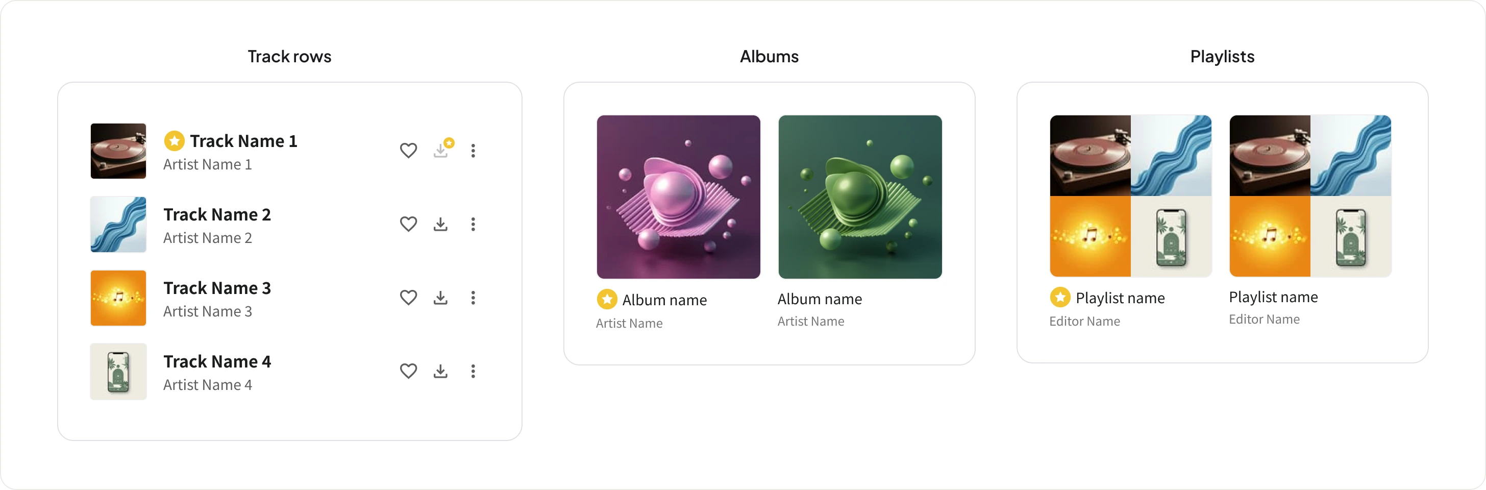
Every label but one cleared the five-hour plan. The last one refused — their catalogue would be 30-second previews only — with one added requirement: users must never be able to tell which label was missing. This created a UX problem: users needed to know which tracks were free vs. 30-second preview, without the reason being explicit.
The solution: a Premium icon system that signals upgrade potential rather than restriction. I originated the concept and created wireframes; a UI designer executed the visual designs from those wireframes. I supervised and directed throughout — running an internal survey when the team disagreed on execution, and selecting the final variant based on recognition data.
The crown read as "pay more, get the luxury tier." But the actual upgrade path was from the free Bundle Plan to the Rakuten Card/Mobile member plan — priced below Standard with no feature difference beyond price, and cheaper than the equivalent plans from major competitors. A crown oversold what upgrading meant: it wasn't a splurge, it was members claiming a price advantage they already qualified for. That mismatch was the wrong signal to send.
My hypothesis going in was that a plain star risked being read as "favorite" rather than "premium" — and the recognition test confirmed it. Multiple respondents described the star-only icon as looking like a bookmark or favorite marker, not an upgrade signal.
When the team couldn't agree, I ran a recognition test with 30 Rakuten Mobile users who didn't yet use Rakuten Music — an unbiased sample with no prior exposure to any of the three concepts. The result was decisive enough to end the internal debate immediately: star-in-circle was the clear majority pick, consistently read as "premium / good value" rather than "restricted" or "favorite." (Specific figures kept confidential, but the margin wasn't close.)
This was an internal recognition test, not an external user study — the release timeline didn't allow for one. I'd have preferred real users, but an unbiased internal sample was the fastest way to settle the disagreement without delaying launch.
01
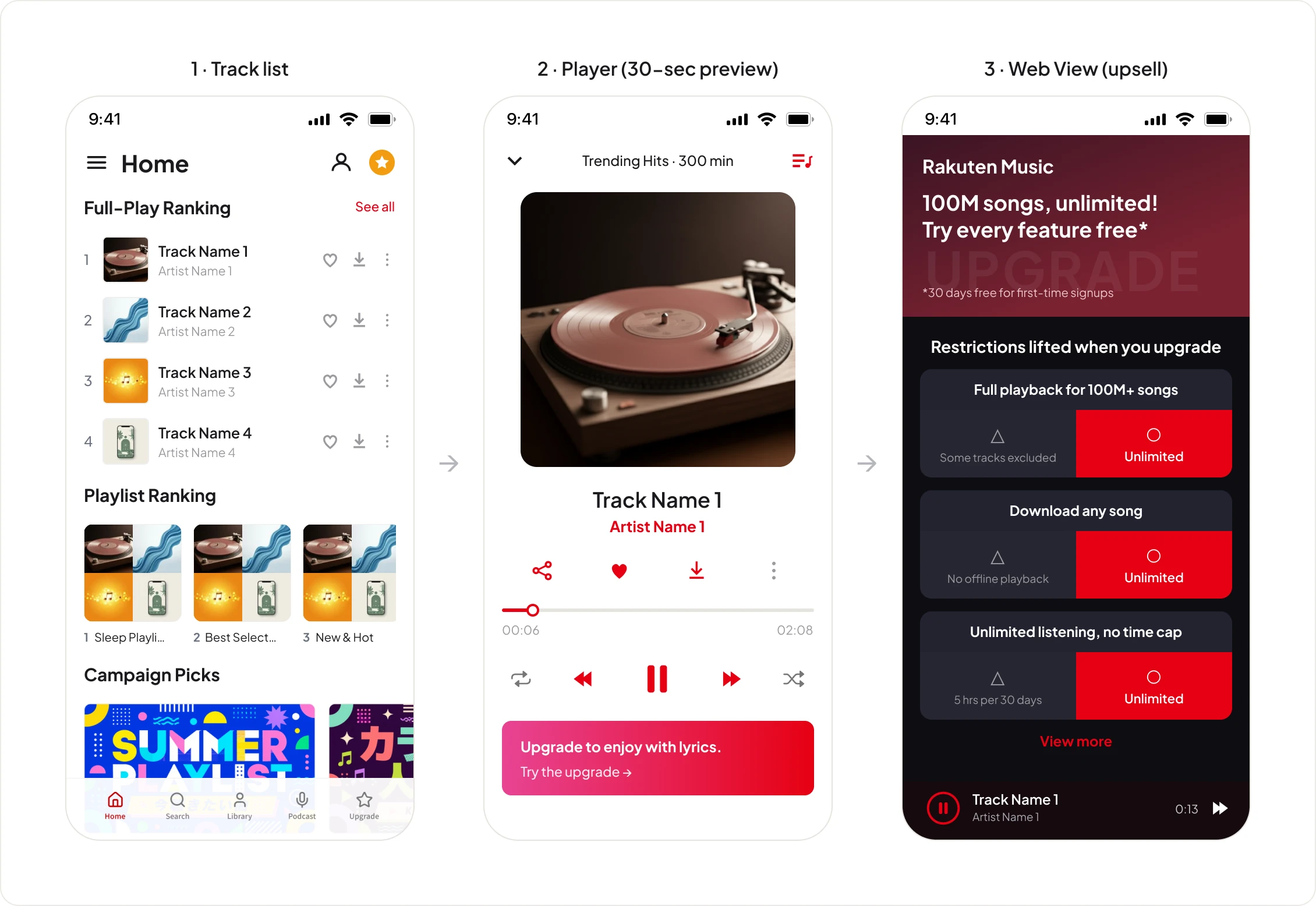
Icons placed on tracks, albums, and playlist rows — indicating Premium access without naming the excluded distributor. Tapping triggers a 30-second preview and opens a web view upsell. Originated by me, variants selected via internal survey after team disagreement.
02
I designed the complete user journey across platforms: Rakuten Mobile LP → sign-up → onboarding → in-app experience → upsell moment. No other role owned this cross-platform continuity.
03
Upsell surfaces at the natural moment of desire — when a user taps a premium track mid-listen — rather than interrupting discovery. This screen appears only after users have already signaled intent to upgrade.
04
Worked closely with the PdM through continuous alignment, and bridged between the UI designer and engineering on spec handoff.
04 — Impact
The bundle plan launched into Rakuten Music's strongest growth period. These results came from channel strategy, pricing, and design working together — each caption below marks the specific link in that chain my design work owned.
Growth concentrated in the bundle channel — I designed its entire entry experience, from carrier LP to onboarding.
Engagement with the on-demand free tier — the model my play-time analysis of light users helped validate.
Most free users never hit the playback cap — conversion was driven by the Premium icon system and contextual upsell I designed.
Downstream of the conversion lift — sustained by the upgrade flow I designed end to end.
05 — End-to-End Flow
Every constraint in this project came from somewhere else — a label's catalogue rights, Mobile's ownership of the plan's messaging, engineering's capacity. None of those parties were talking to each other by default. My job was translating between them so the user never saw the seams.
During internal QA, I found a problem no one had specced for: one label's tracks — now 30-second previews only — were flooding the real-time ranking, the first thing users saw on Home. For Bundle Plan users, the top of the app looked like a wall of upgrade prompts. I flagged it, got PM sign-off, and had a spec for a filtered ranking — excluding preview-only tracks for this segment — in front of engineering within days. It shipped in under two weeks.
Rakuten Mobile's "Saikyo Plan" bundled dozens of perks — Music was one line among them, and Mobile's own landing page treated it that way. Getting real visibility there meant negotiating directly with the Mobile team, on a page I didn't own and couldn't design myself.
I named it "Bundle Plan." Having watched an earlier Rakuten tier get renamed under legal pressure after launch, I went into this project treating naming as a design decision, not an afterthought. I brought the PM three candidates: one referencing the ecosystem angle, one naming the specific partner service directly — a deliberate decoy, since it would break the moment a second partner joined — and "Bundle Plan," short enough for ad copy, plain enough to survive legal review, and generic enough to scale as the partner list grew. The comparison did the work; "Bundle Plan" was the obvious choice once the other two were on the table.
After an early test build slipped the original release date, I started a self-initiated priority tracker — shared with the PM — and ran weekly syncs with engineering to keep delivery visible going forward.
06 — Reflection
No project lands perfectly. Looking back, there are areas I'd approach differently — and lessons that shaped how I work now.
Onboarding was scoped out. Under pressure to hit the release date, anything beyond core functionality was deprioritized. But for bundle plan users, onboarding wasn't a nice-to-have — it was the only place to explain what the Premium icon system actually meant. We tried to cover it on the website, but that's not where users are when they need to understand it.
At the time, I didn't fully grasp the importance of onboarding. After moving to the US and using American apps daily, I noticed how much more intentionally onboarding is designed here compared to Japan. Instead of "figure it out as you go," users are shown exactly what experience awaits them — which builds desire before they even start. If I'd had that perspective then, I would have fought to keep onboarding in scope, framing it not as an extra feature but as the only place where the plan's value could actually land.
More Case Studies
Reframed discovery from algorithmic recommendations to a curation-led model across an 8-year product evolution.
Rebuilt my design-to-ship workflow around a two-gate, verification-first system — then proved it building and shipping an AI product alone.