Rakuten Group · iOS · Android · 8-year engagement
Redefining music discovery for a service facing existential pressure — by rebuilding UX strategy from the ground up.
01 — Problem Definition
The service had no clear product direction. Without a defined vision, the team defaulted to copying the most popular and visually polished competitor — Spotify — not to beat them, but simply to make the product look credible. The result was a surface-level imitation that couldn't replicate the underlying experience.
When new leadership arrived, the mandate was blunt: the product had no design concept and no defined user — build one. I owned that assignment. Partnering with Rakuten's cross-organizational UX research team, I led the process from research through definition, then built the strategy into a presentation and pitched the new product direction — one grounded in Japanese user behavior rather than borrowed from a Western model — to leadership.
Finding 01
The first redesign mimicked Apple Music aesthetics — large imagery, generous whitespace, low information density per screen. It improved appearances without solving user needs. The product still felt unfamiliar and hard to navigate.
Finding 02
Rakuten Music's catalog matched competitors track-for-track — yet users consistently rated it as having fewer songs. The problem wasn't content volume; the experience made the library feel inaccessible, so users perceived scarcity where there was none.
Finding 03
A quantitative user study revealed that the primary music discovery trigger in Japan is tie-up promotions — music through TV dramas, films, and ads. Algorithmic recommendations were low-trust. Social proof (rankings) and cultural context mattered far more.
02 — Strategy & Key Decision
I led user research through interviews and surveys with users of competing apps and our own app, then created a product "to-be" vision — a big-picture design of where the app should go — and cut it into incremental projects. The core strategic decision was which discovery model to pursue.
Target User Shift
Before this project, there was no defined target user at all. Research and persona work identified the real opportunity: recent adopters with lower digital literacy — people who had just started using the app and weren't yet confident navigating it. This reframed every design decision: visibility over discoverability, clarity over elegance, fewer taps to a confident action. The favorites and download buttons, for example, moved from a hidden context menu to always-visible controls — a decision that generated internal debate, but was grounded in behavior data.
03 — Design Solution
Rather than a single redesign launch, I created a "to-be" vision for the entire app and then prioritized it into executable projects. Each change was anchored to a specific user behavior or conversion metric. I owned UX strategy, information architecture, and all screen design — wireframes and UI direction by me, component execution by the UI designer, with my direction and review throughout. Native app engineering implementation was handled separately by the engineering team.
01
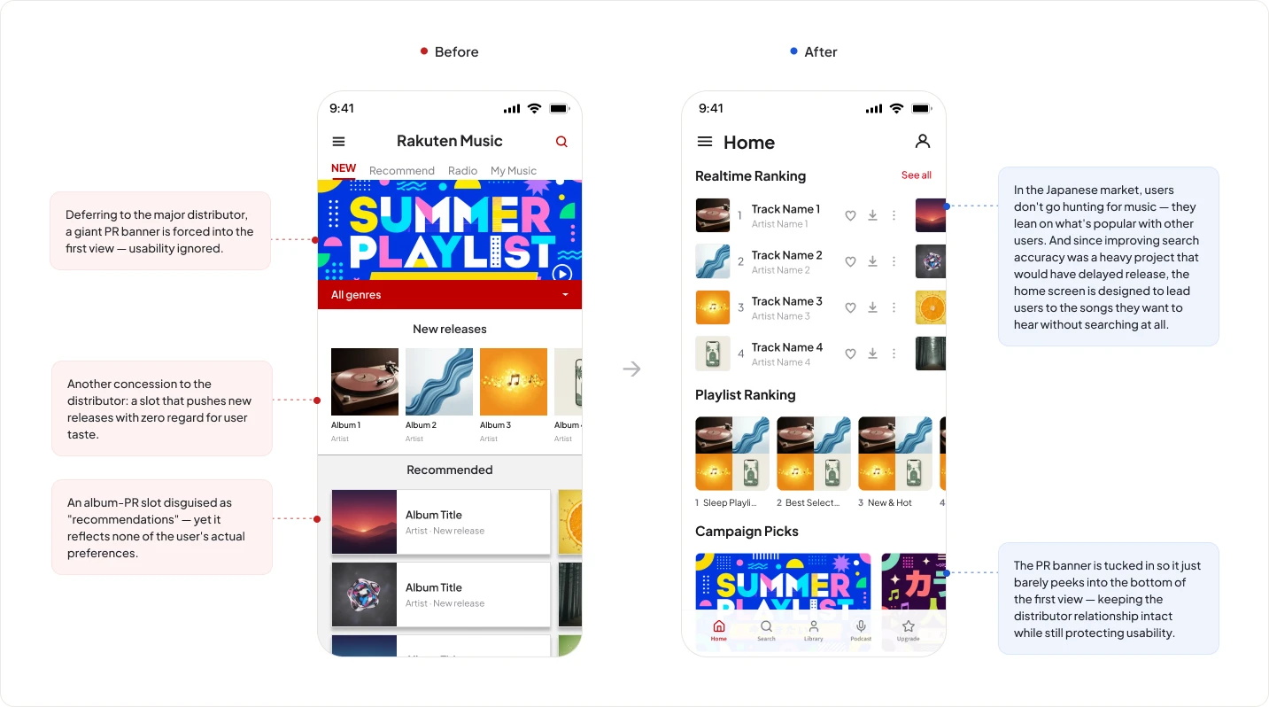
The home screen's prime real estate had been given to promotional banners for label partners — content that served business relationships, not users. I replaced that top position with rankings (the highest-trust discovery signal in the Japanese market) and playlists curated by Rakuten Music's own editorial team. Image sizes were reduced and whitespace tightened to surface more content per scroll. A user opens the app to find something to listen to; the home screen now answers that intent immediately.
02
Previously, adding to library required tapping a "+" icon — which then transformed into a download button, requiring a second tap. The flow was a two-step sequence that many users never discovered. Data showed that users who both favorited and downloaded tracks had significantly higher retention and paid conversion rates. I redesigned the track row to show a heart icon (favorites) and download icon side by side, always visible — making both actions immediately available and replacing the "+" with a heart to reflect the emotional action users were actually taking.
03
Before executing any single screen, I created a comprehensive to-be vision for the entire product — then broke it into prioritized, deliverable projects. This gave the team a shared destination and made each iteration feel purposeful rather than reactive. It also created the foundation for the Bundle Plan project, which built on the infrastructure and UX patterns established here.
04
Built design guidelines that codified typography, spacing, components, and interaction patterns — establishing consistency across a product that had grown without shared standards. This also improved readability across smaller screens and supported more accessible text scanning. Personally reviewed engineering implementation for fidelity, catching gaps between spec and build before they reached users. This quality layer was not a separate role; it was part of my ownership.
04 — Impact
This work shipped as a series of releases over several years, not a single launch — so there is no clean before/after number that isolates this redesign. What I can show instead is the causal chain: what changed in the product, why, and what each change was designed to move.
Prior research had shown that users who actively used My Page retained at significantly higher rates. The redesign was built to drive exactly that behavior — and it did. Favoriting and downloads both increased, My Page usage grew, and as the research predicted, those users upgraded to paid plans — the core revenue driver of Rakuten Music. This project also established the shared definition of what Rakuten Music should be, the foundation every subsequent initiative was built on. The Bundle Plan (Case Study 01), built directly on this foundation and user base, is fully quantified.
Home redesign
Rankings & editorial playlists replace PR banners
Perception
Catalog feels larger & more accessible
Engagement
Favorites & downloads increase
Conversion
My Page usage → paid plan upgrades — the core revenue path
05 — Process & Scope
The role extended far beyond UI design. I defined what the product should become before a single screen was drawn, then led execution across multiple phases — as the sole UX designer embedded in the product team, working with two UX researchers from Rakuten's central UX organization, one UI designer, and one PM.
To be precise about ownership: quantitative research was designed and reported by an external agency under my supervision. Qualitative interviews were co-designed with the central UX team — I deliberately had non-design team members conduct the interviews themselves, turning research into internal education that put real user voices in front of the whole team. For the home screen, I built near-final wireframes from existing components and directed the UI designer through execution, reviewing everything. The design system was defined with the central UX team under my supervision — they documented the guidelines, the UI designer built the library, and I owned quality: reviewing engineering implementation in detail and bridging between business stakeholders and designers.
Phase 1
Research & Strategy
Persona · User interviews & surveys · Competitor analysis · To-be vision
Phase 2
Home Redesign
IA · Information hierarchy · Rankings & playlists · Content model
Phase 3
Ecosystem Integration
Loyalty system · Rakuten Points · Rakuten Books tie-in
Foundation
Design System
Guidelines · Component library · Engineering QA
Outcome
Bundle Plan
Built on this UX foundation → Case Study 01
06 — Reflection
No project lands perfectly. Looking back, there are areas I'd approach differently — and lessons that shaped how I work now.
Putting rankings at the top of the home screen worked — users discovered more content and engagement increased. But within a few weeks of launch, a side effect emerged: plays concentrated on the top-ranked tracks, and the same songs stayed there. The home screen stopped feeling fresh. We caught it quickly and applied a temporary fix by adjusting the ranking algorithm — but that was handled by the sales and engineering teams, not a structural design solution. The root problem, that surfacing one high-trust signal too prominently can reduce the diversity of what users encounter, wasn't something we fully anticipated at the design stage.
I proposed a personalization layer that would reorder home screen sections based on each user's listening history — someone who always plays from rankings would keep rankings at the top, while someone who navigates from their library would see their recent plays surfaced first. This would have addressed the fixedness problem at the UX level rather than patching it in the algorithm. The proposal didn't move forward: backend implementation costs were too high and it didn't align with the business priorities at the time. Looking back, I'd frame it earlier and more explicitly as a retention mechanism — connecting it to the conversion data we already had — to make the business case harder to defer.
More Case Studies
Redesigned the subscription entry point to convert free listeners into paying members at scale.
Rebuilt my design-to-ship workflow around a two-gate, verification-first system — then proved it building and shipping an AI product alone.